Once upon a time, there was a rotisserie
Visual Design
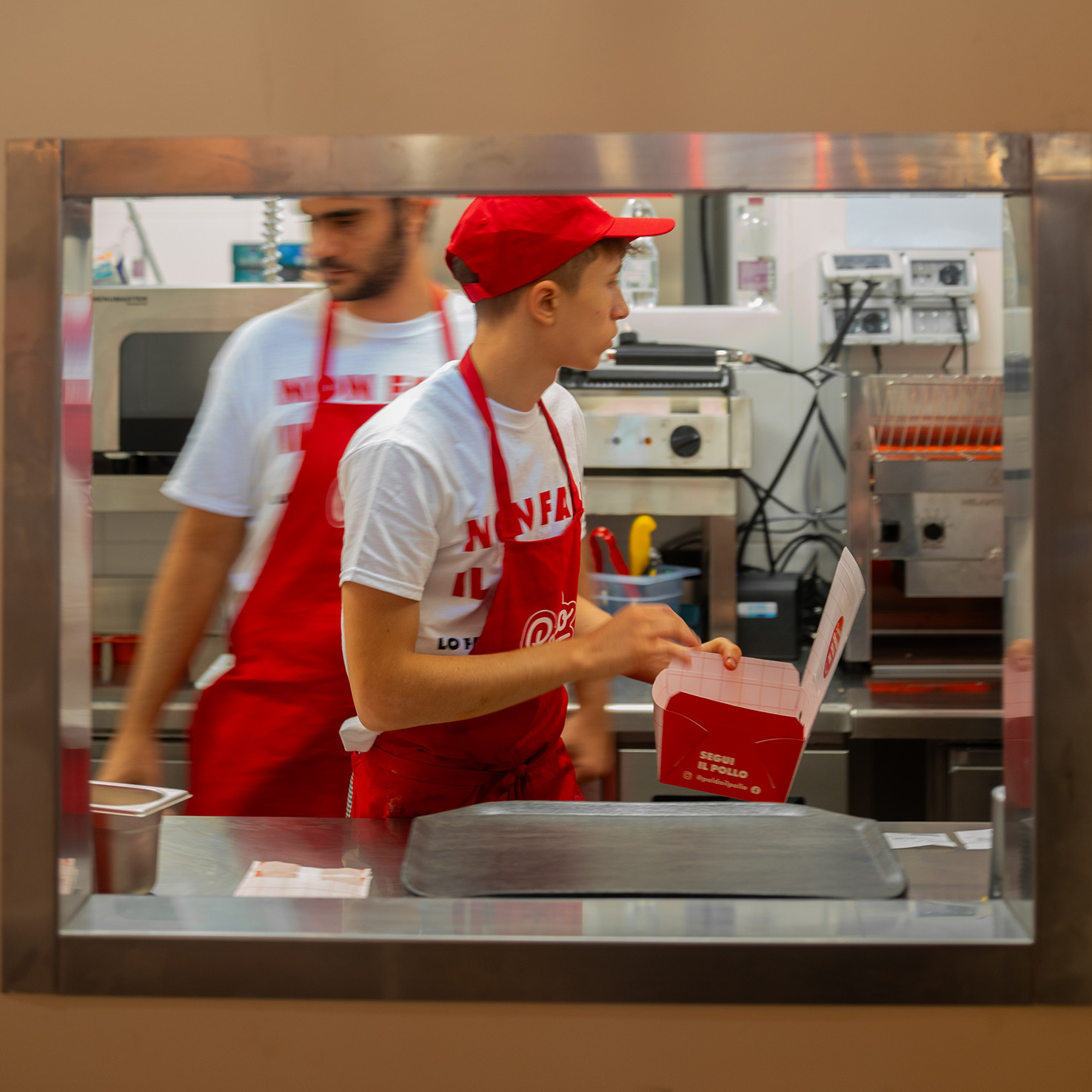
Retail Design
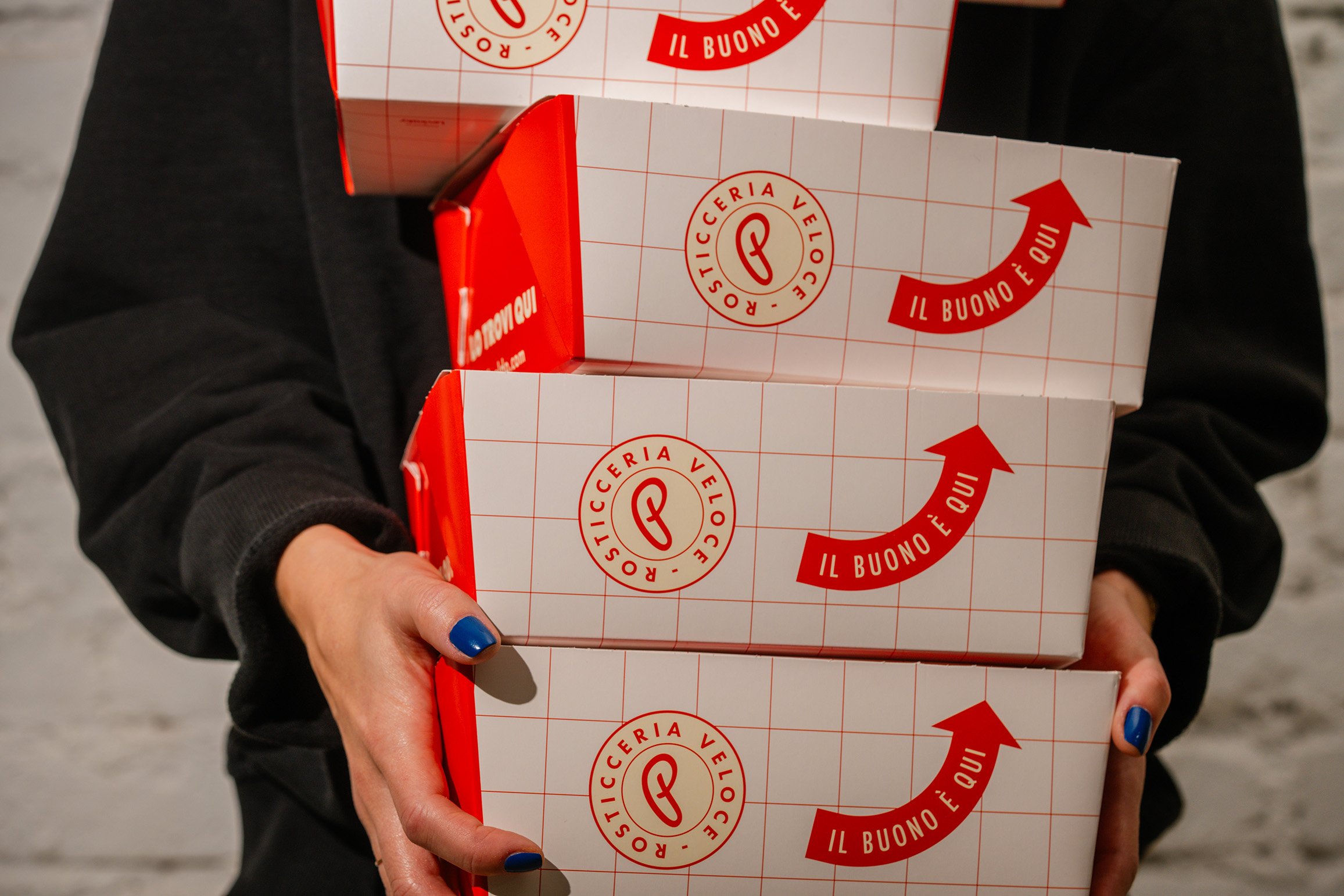
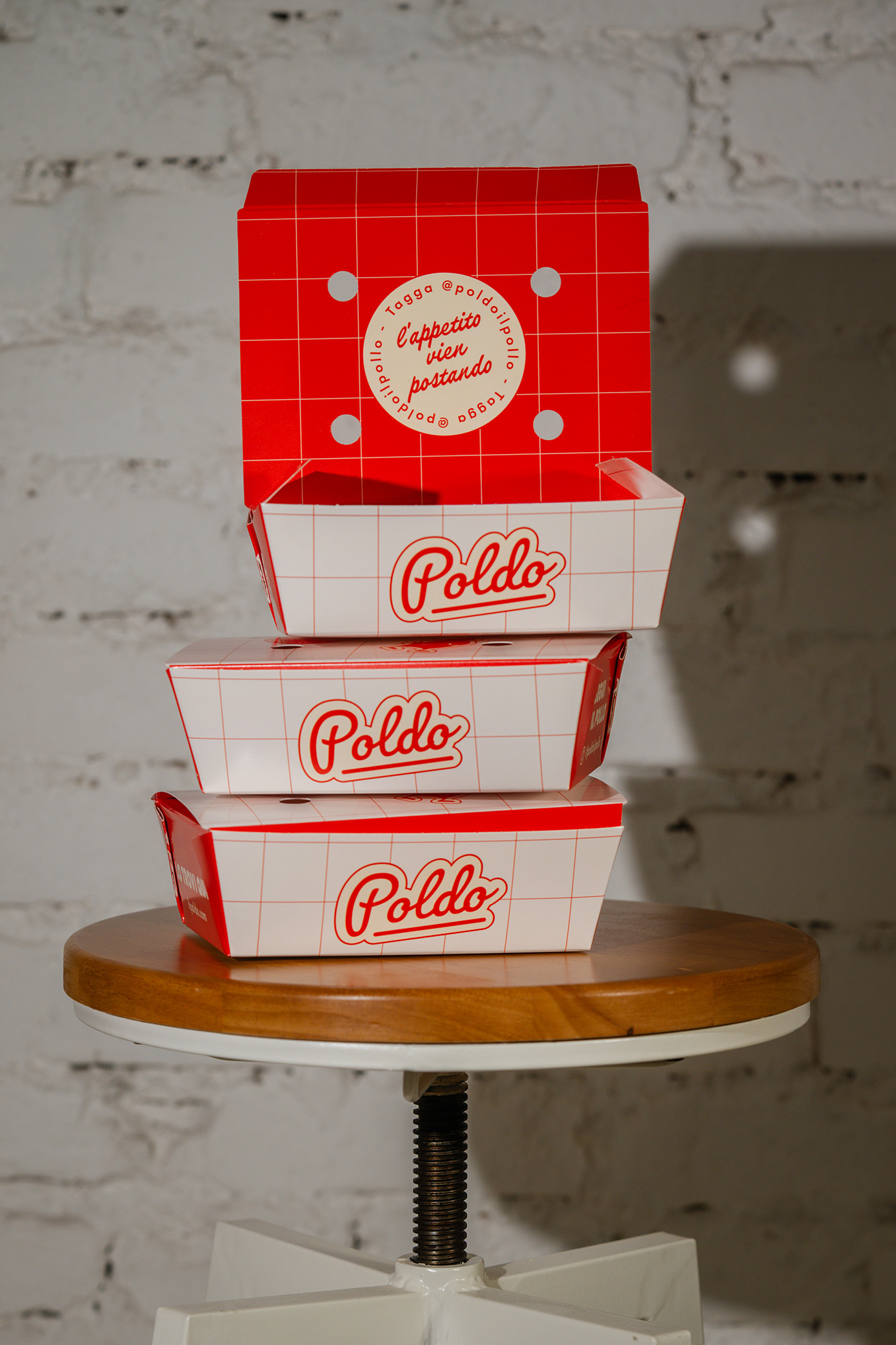
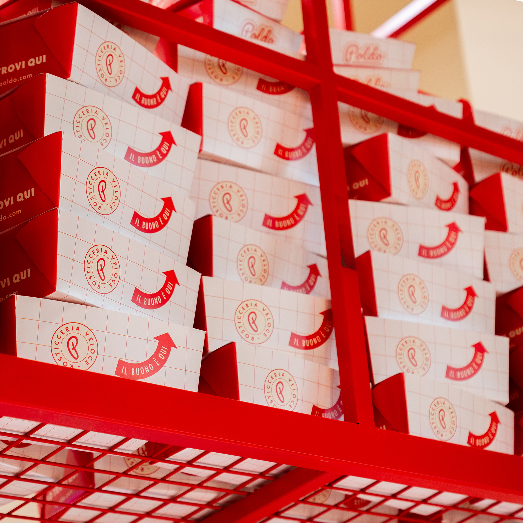
Packaging Design
Web Design & Digital content
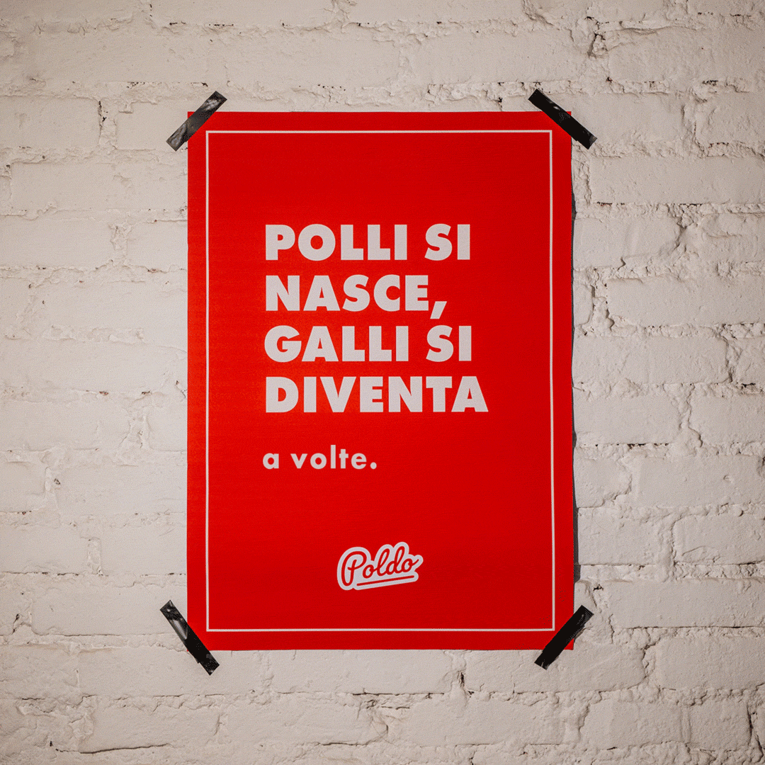
Copywriting
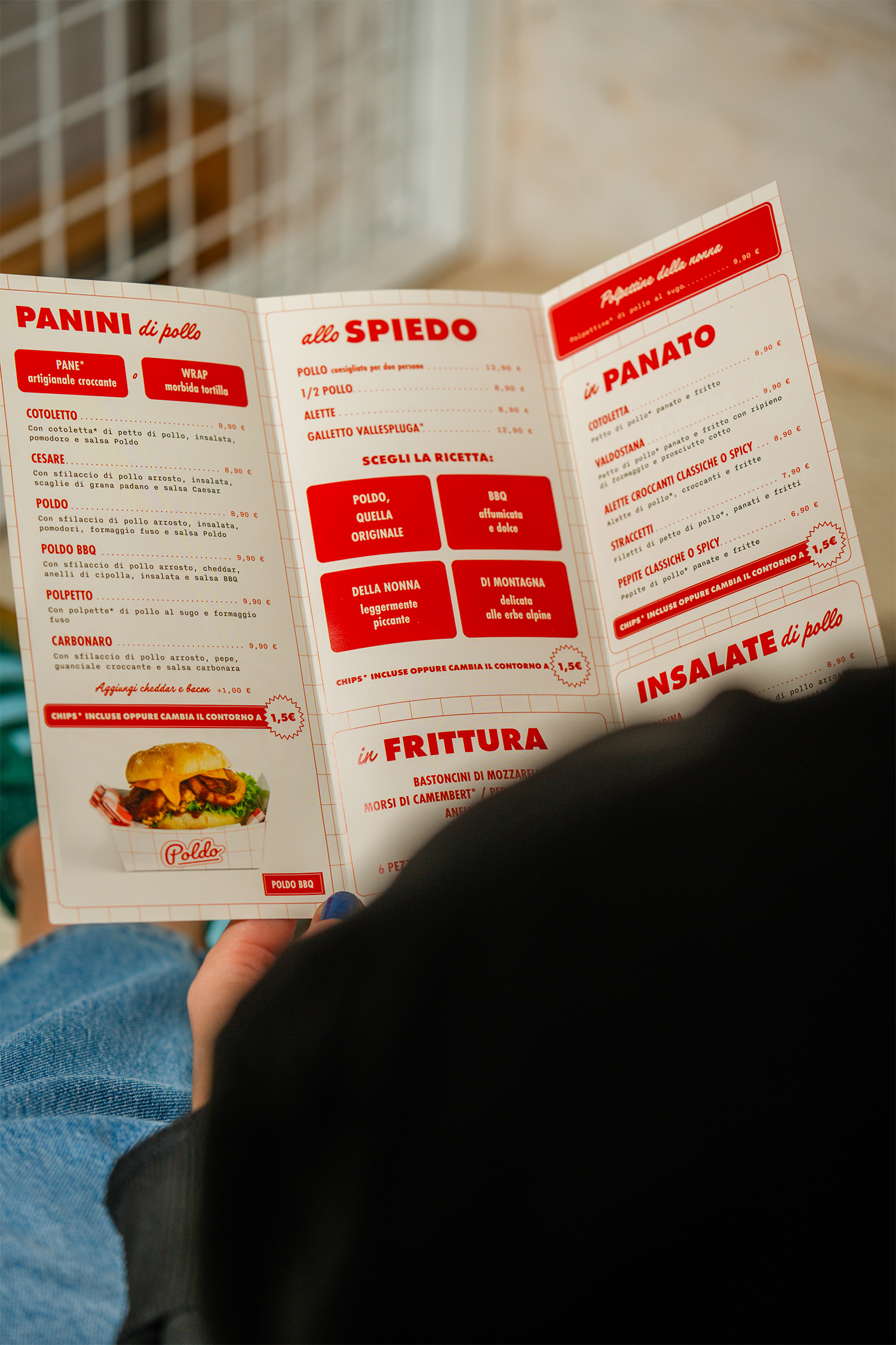
Classic flavours, traditional recipes – something for everyone.
Poldo was born from a straightforward idea, a traditional Italian chicken fast food – tasty like the old days, just faster. A humble formula with a clear intent and with a off-the-cuff narrative.
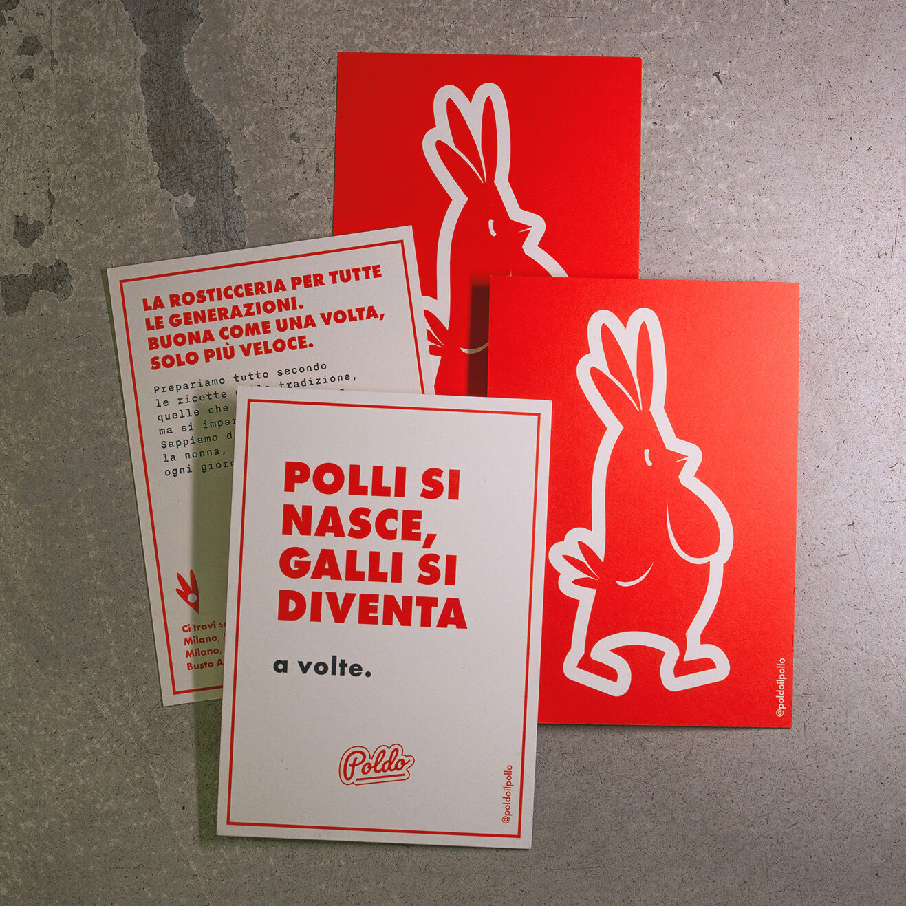
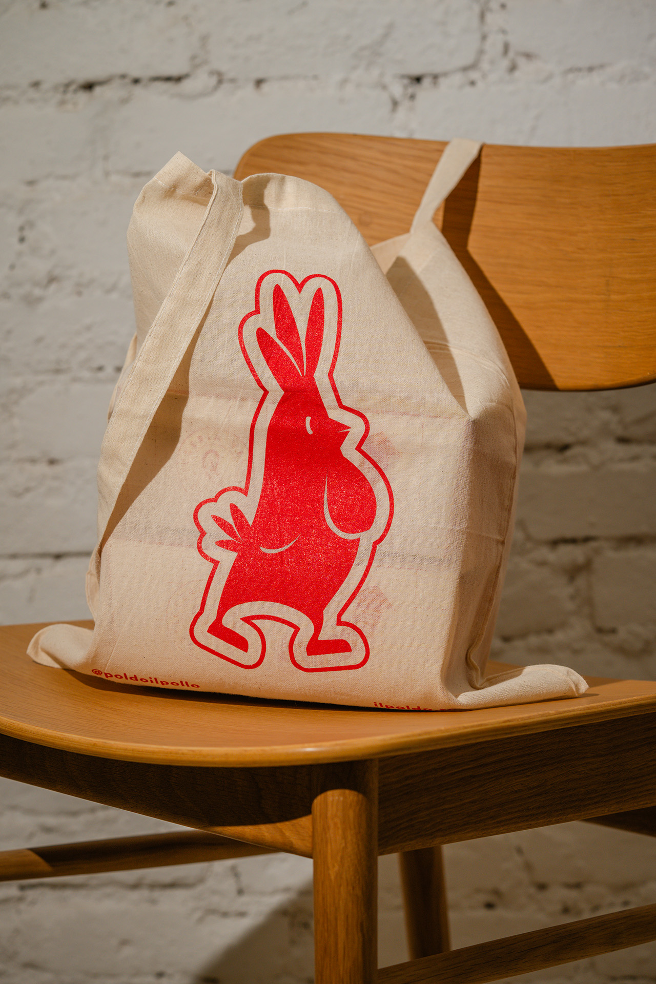
The brand is also explicit: its name reminds the sound of the Italian word for chicken, “pollo”, but without the need to say it. That’s how Poldo turns out – a simple character, just like its products.
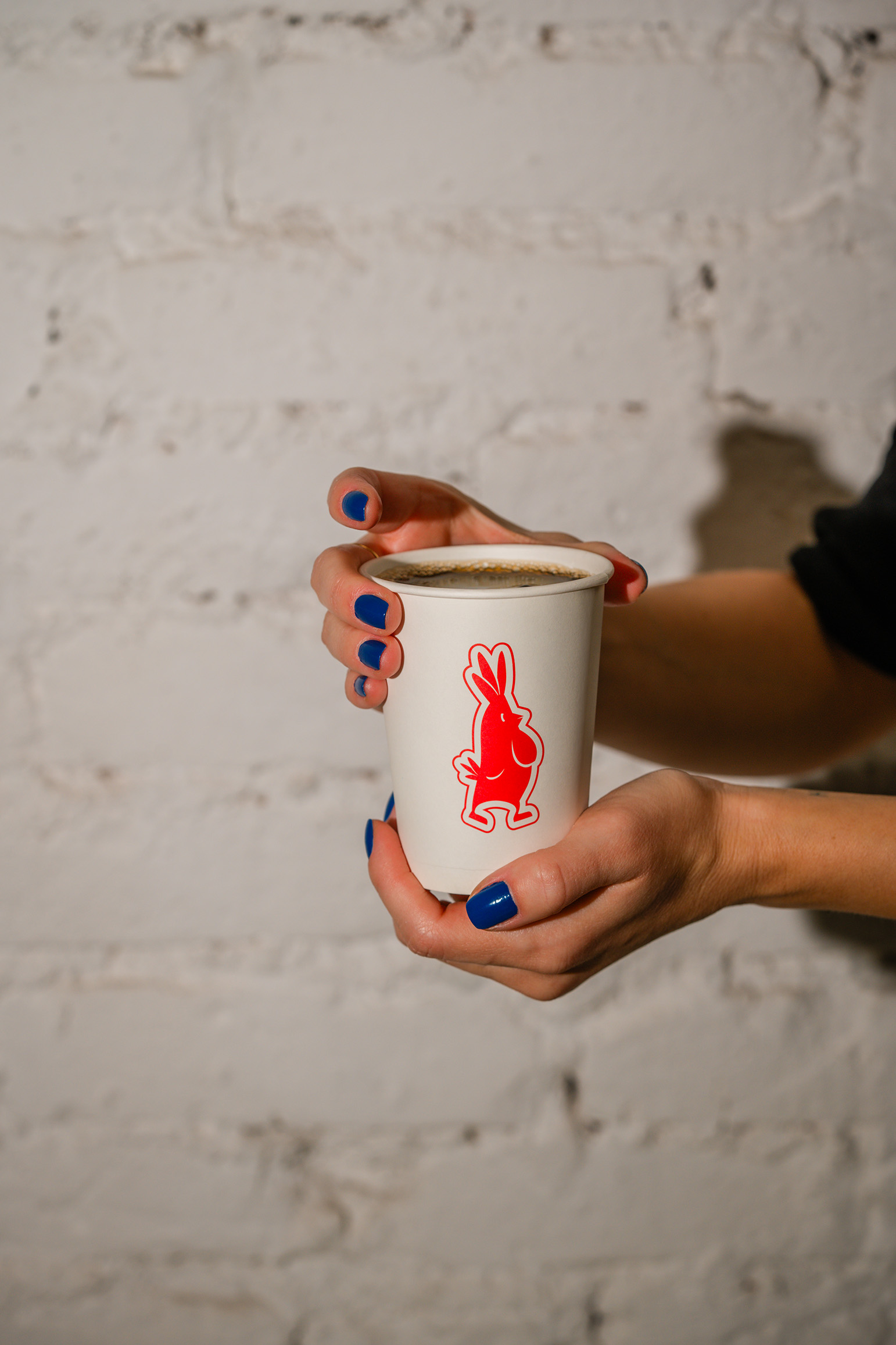
The visual identity is linear – clean illustrations with a minimal typography and an essential palette. The design is uncluttered, with a few but iconic elements easy to recognise in its branding and materials.
Once upon a time, there was a rotisserie
Visual Design
Retail Design
Packaging Design
Web Design & Digital content
Classic flavours, traditional recipes – something for everyone.
Poldo was born from a straightforward idea, a traditional Italian chicken fast food – tasty like the old days, just faster. A humble formula with a clear intent and with a off-the-cuff narrative.
The brand is also explicit: its name reminds the sound of the Italian word for chicken, “pollo”, but without the need to say it. That’s how Poldo turns out – a simple character, just like its products.
The visual identity is linear – clean illustrations with a minimal typography and an essential palette. The design is uncluttered, with a few but iconic elements easy to recognise in its branding and materials.